“Many of us absorb and sift through huge quantities of information on the web daily. We've trained ourselves to quickly pull out the most important information and decide if the rest is worth our time. When this happens, which is most of the time, people commonly use F-shaped reading. An F-shape arises because we're trying to be efficient and decide if this page is worth more of our time.”
What is F-shaped reading?
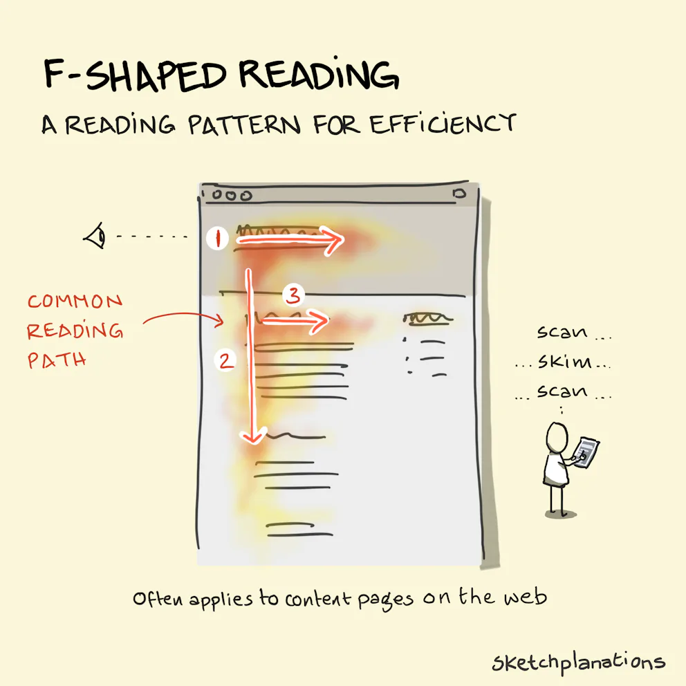
F-shaped reading is a pattern seen in eye-tracking studies of people reading content on the web. It looks like scanning the top words first, maybe making it to the end of the headline, then moving down the left-hand side and heading right again when a sub-head or line draws our attention.
Why an F-shape?
F-shaped reading means your headline and first sub-head matter a lot. The content on the left matters more as a way to draw people into your work. It's hard to get that from a block of text, so we improvise — getting a sense of the content areas from the headlines and scanning quickly down the page to decide which blocks, if any, are worth reading.
This is one of many user-behavior principles good web design employs. The way content is structured, ordered, sized, grouped, and edited is to facilitate F-shaped reading and many other user-psychology considerations.
If your website ignores the principles of good design, visitors are highly likely to close the tab and move on. As web users, that's what we're all looking for — we don't have time to sift through clutter and an amateur site. Do we walk into the fancy organized store, or the messy disorganized one?
Smart web design is a science and an art
It's not personal taste and opinion. You want a knowledgeable web designer ensuring your site uses modern user behavior and psychology data to inform its structure and experience — that's the science. From there it's about creating a pleasing, engaging visual experience that employs all sorts of important things — that's the art. A dual-action interplay, and one you want to make sure to get right.